
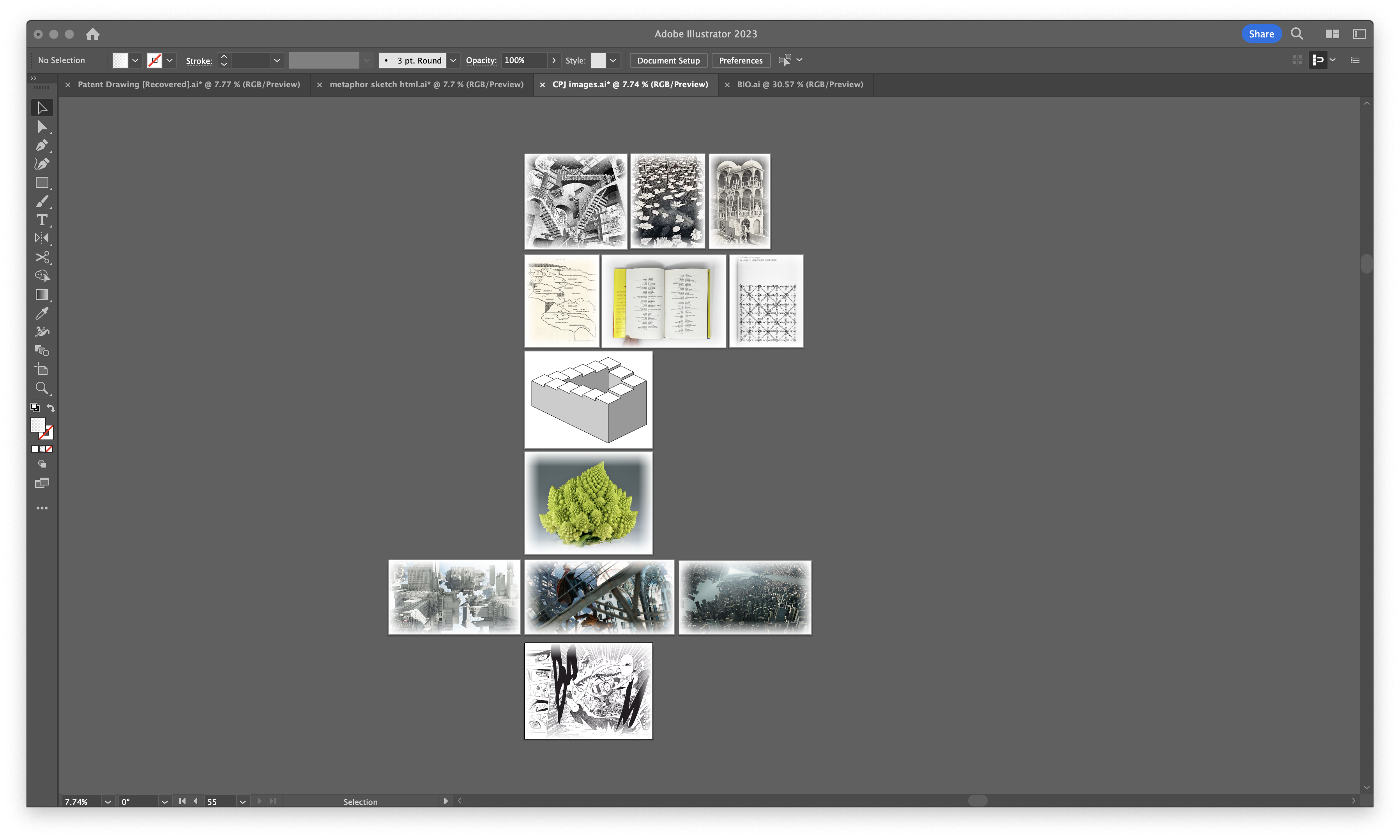
This week, I began the process of compiling images for my visual compendium, and it has been a reflective moment. As I sorted through the images, I realized how much of my project is built on layers of inspiration and experimentation, each contributing to the larger narrative of rethinking how we interact with text. Grouping the visuals into sections forced me to revisit and reassess the purpose behind each image—why it was included, what it represents, and how it connects to my project’s overarching theme of breaking habitual patterns in typing.
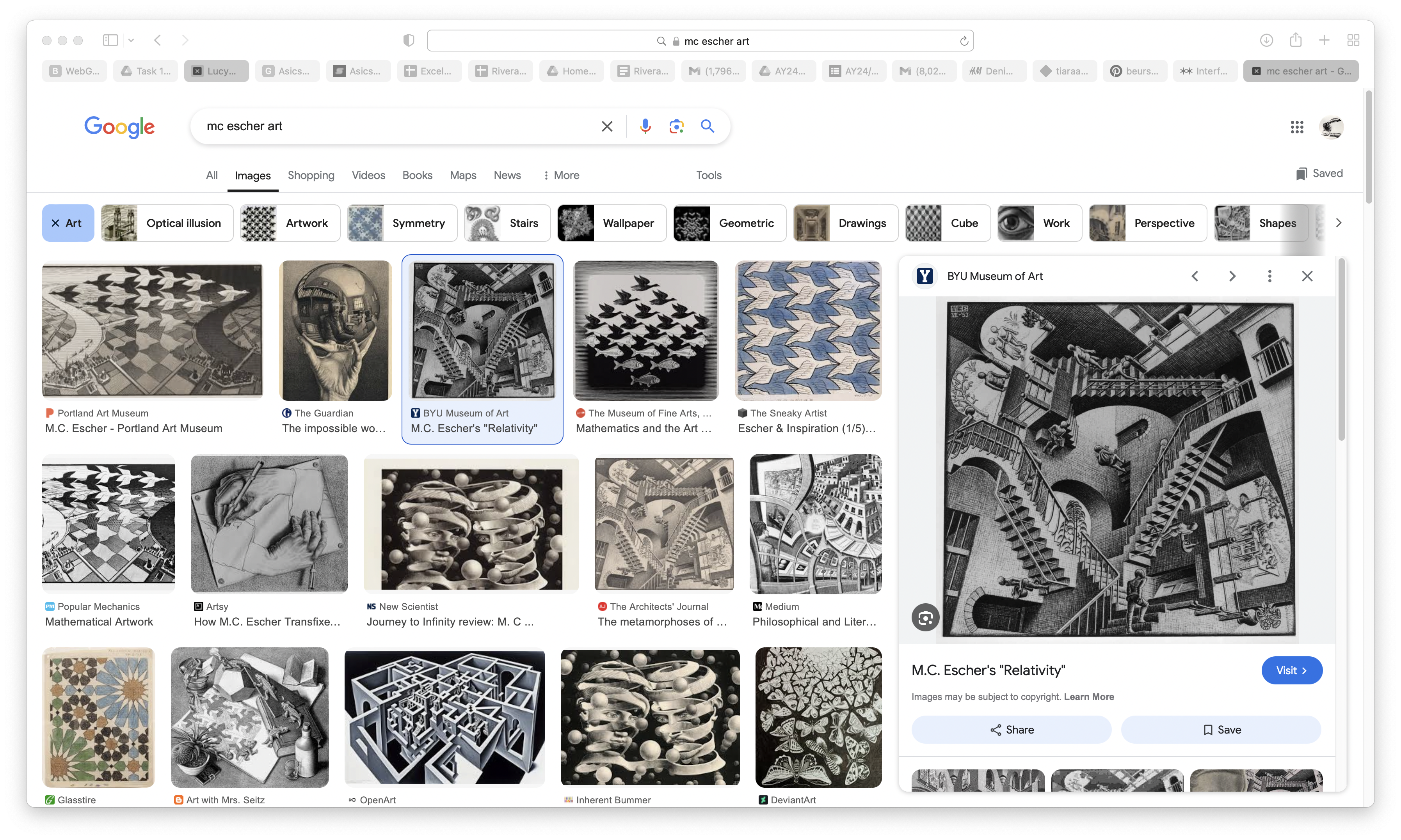
As I have already mentioned, I sorted my visual compendium into groups so that it won’t feel repetitive and all over the place, so I included MC Escher’s works under art and abstract like Relativity because they challenge conventional perspectives and play with impossible structures, demonstrating how design can bend reality. His work relates to my project as it inspires me to disrupt traditional, linear keyboard interactions and explore how typing can become a more imaginative and dynamic experience rather than a predictable process. I also found out about him when I was researching Romanesco Broccoli too.
Link here.
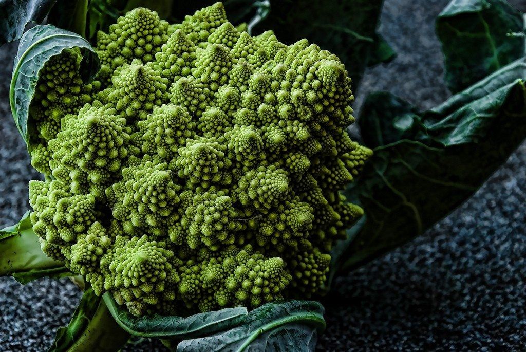
Which is the fractal patterns of Romanesco broccoli, the reason why I added this lovely vegetable in my visual compendium is because I remember it looked like one of my HTML sketches where the words turn spiral, so this vegetable illustrate organic complexity and beauty in repetition, making it a perfect example of natural harmony. Another reason why I included this because its intricate yet structured form inspires my exploration of text arrangements that mimic natural systems, creating layered, engaging layouts that are both aesthetically pleasing and conceptually meaningful.
Link here.
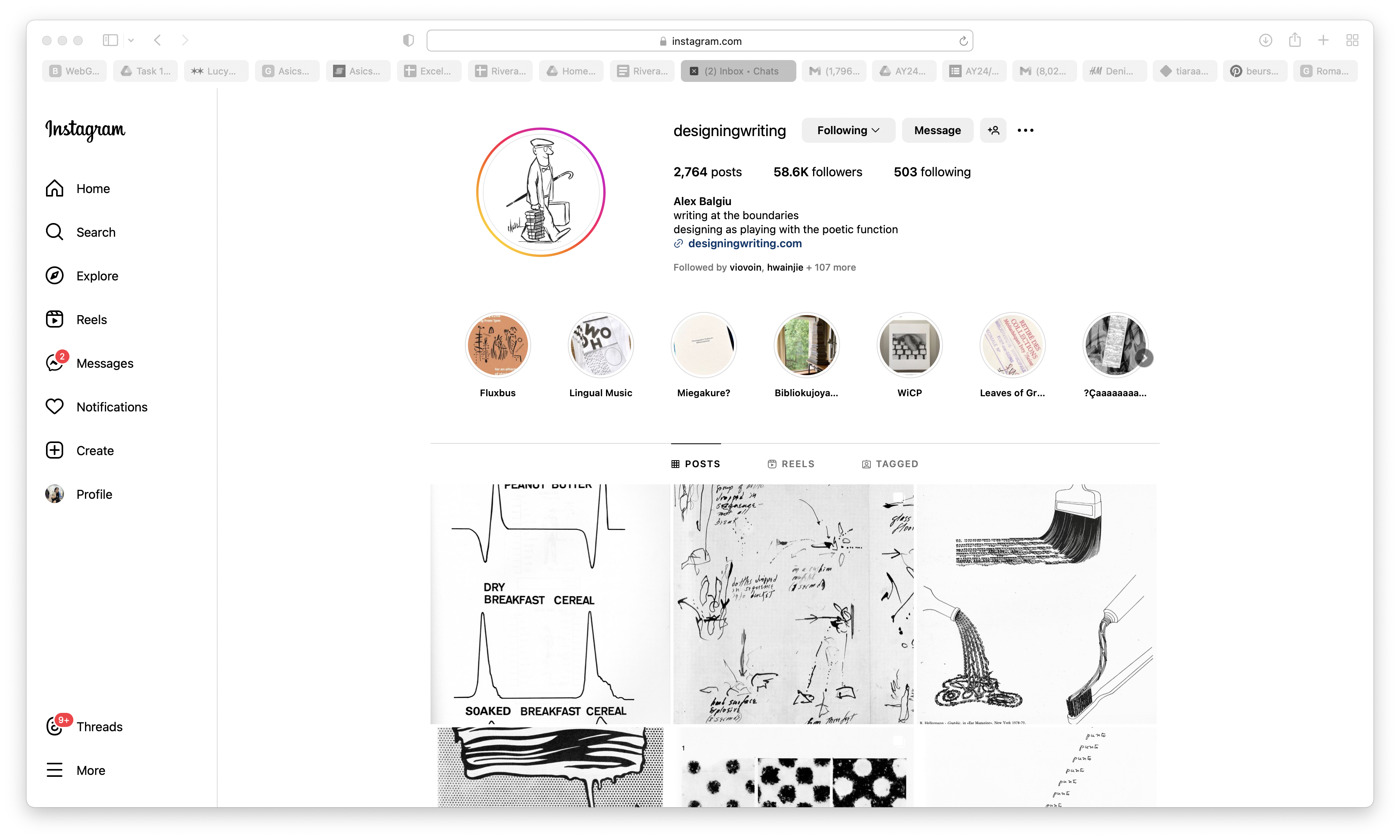
Of course I had to add some typography patterns in my visual compendium, I found some on an instagram account called, “designwriting”, John Giorno’s Cancer in My Left Ball stands out for its raw and emotive style, breaking traditional poetic formats to connect deeply with its audience. This inspired me to think about how text outputs can evoke emotions and create impactful experiences through design. Similarly, Imitation = Homage uses visual patterns to transform words into dynamic compositions, encouraging me to experiment with layered and multi-dimensional text flows. Lastly, The Cosmic Chief challenges rigid typographic norms by offering fluid, experimental layouts, pushing me to rethink how typing can become interactive and visually engaging, breaking away from static conventions.
I also added the Penrose stairs as I have mentioned in my previous week why it was interesting to me. It is basically an endless loop but despite the endless loop, it doesn’t feel like it and I do wish that I will be able to find a way to make typing engaging the same as how users felt on Penrose stairs.
Link here.
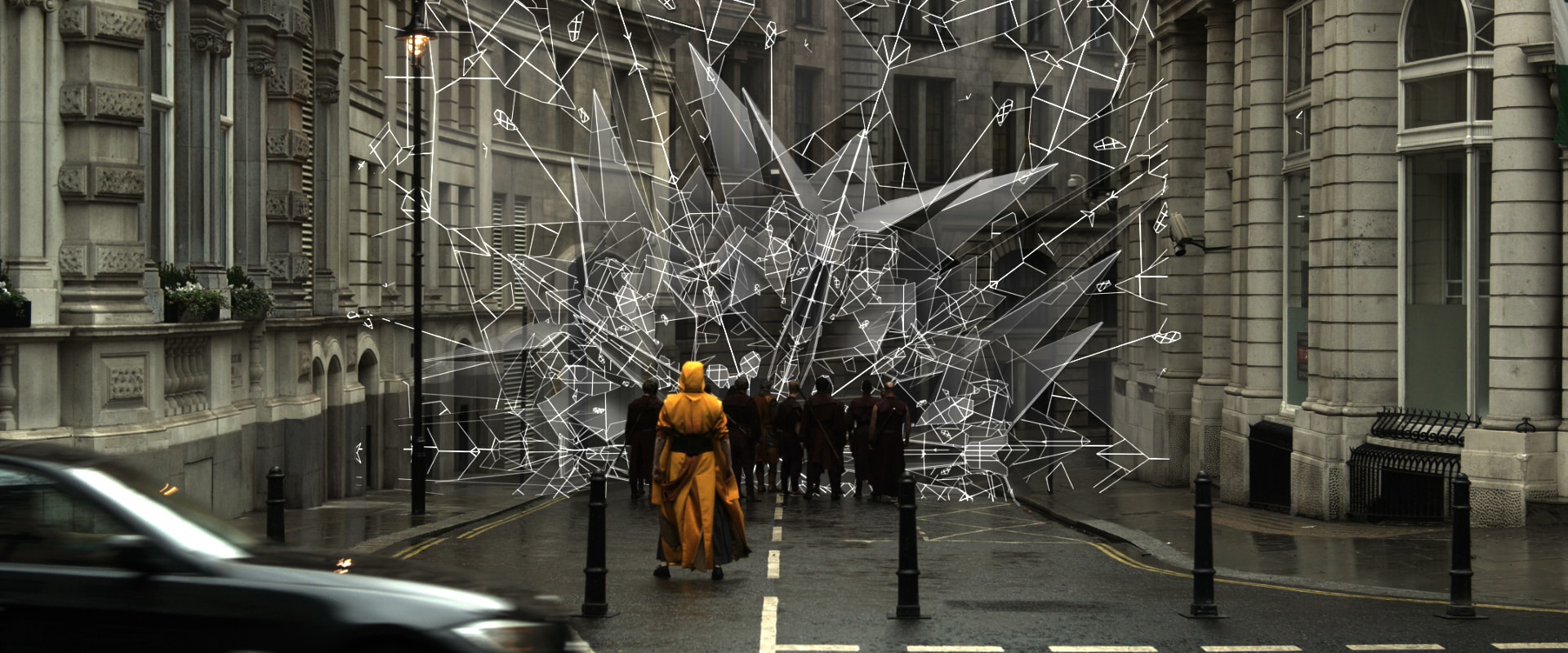
Penrose’s concept also reminds me of Doctor Strange, in the first movie of Doctor Strange, there was this scene called the Mirror Dimension, I chose this as an influence because it inspires me to design text interactions that feel immersive and unexpected, drawing users into more engaging and imaginative experiences, much like the movie’s visual storytelling.
Since I sort of got my content for my visual compendium ready, I started sketching for my website. I wanted my website to have the hint of excel spreadsheet, that’s because I really enjoyed experimenting with excel and email so I guess I wanted my visual compendium to look something similar to tools like that. Here is the first sketch, these are just placeholders, so basically I planned to have 6 columns, but all of them are scrollable. I wanted my images to have that white gradient outline because I just thought it would feel less heavy rather than having that harsh outline, since there will already be a disturbing grid around it.
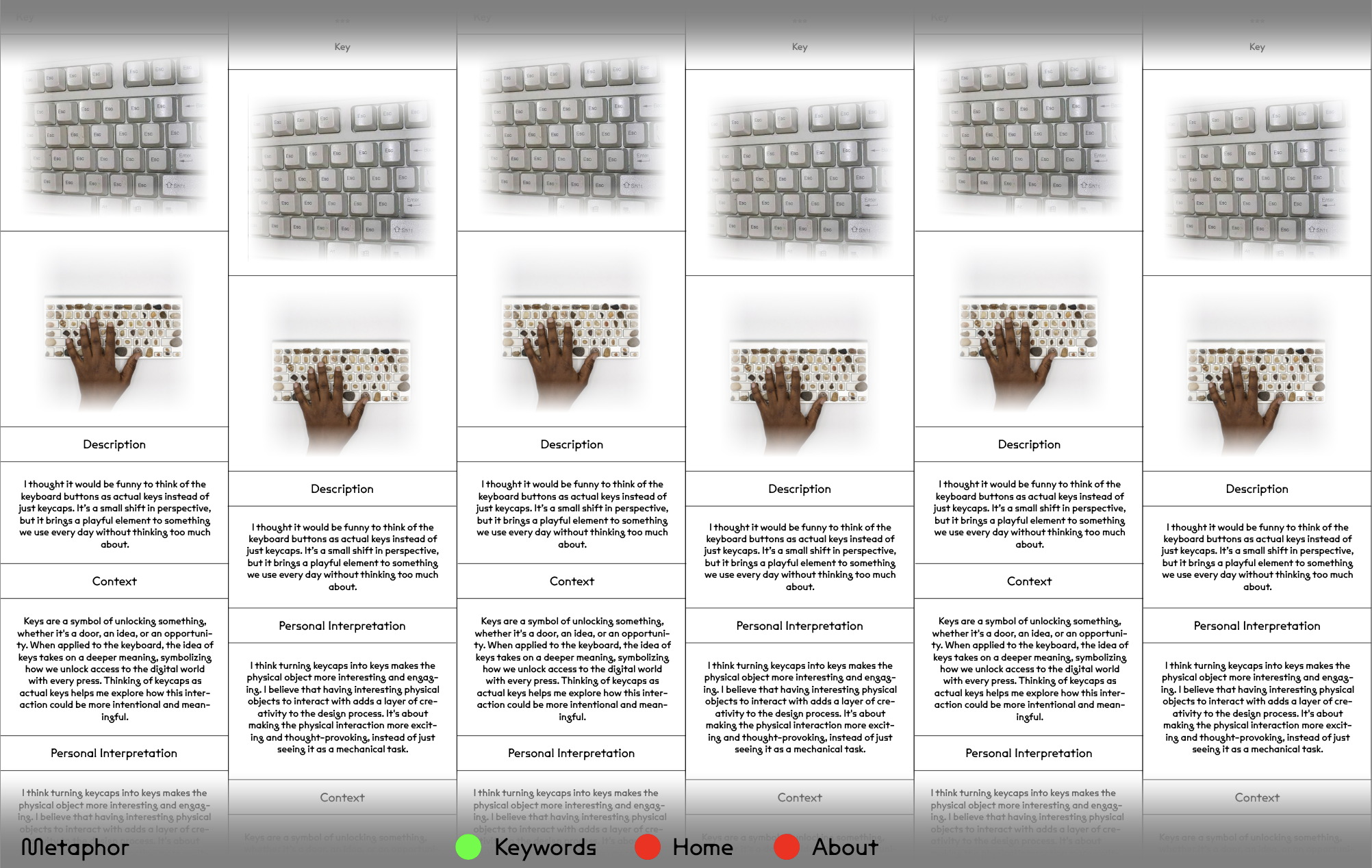
So I sorted them into column right, each column represent a topic, art and abstract, architecture so on and so forth, I will have a description of each and a personal interpretation of what I feel about the works I added in my visual compendium, at the moment I am not too sure if I have to put where I got my sources from, I feel like I have too so I guess I have to find a way that separates it from the look of how I decided to put the description and my personal interpretation.
I also added a gradient header and footer, I don’t know why I did that.. I guess to match how I decided to put the images?
Anyways, I want to talk about my dissertation, it is one week left to my submission for a dissertation draft, I am at my discussion part and as I was writing it, I realised that really none of my works have an interesting interaction nor have a good conceptual meaning, well I guess I can say that I am still trying to figure out what takes the user’s attention in terms of how the text appear on screen. But still, I think I need to continue experimenting during my December holidays, I genuinely feel like I need to really buck up on how I look at this project, I didn’t feel like did much work for this semester so during the holidays I will really continue researching.